
2026 Interior Paint Color Trends for Luxury Homes
Every year the major paint brands name a Color of the Year, and together those picks reveal where design is heading. For 2026, the direction is clear and cohesive: warmth, depth, and grounding. The cool grays and stark whites of the past decade have given way to layered, nature-inspired tones and a "quiet luxury" sensibility that feels rich without shouting. Here are the interior color trends defining luxury homes in 2026, and how to bring them into a South Florida home with lasting elegance.
Warm, grounded neutrals: the new backdrop
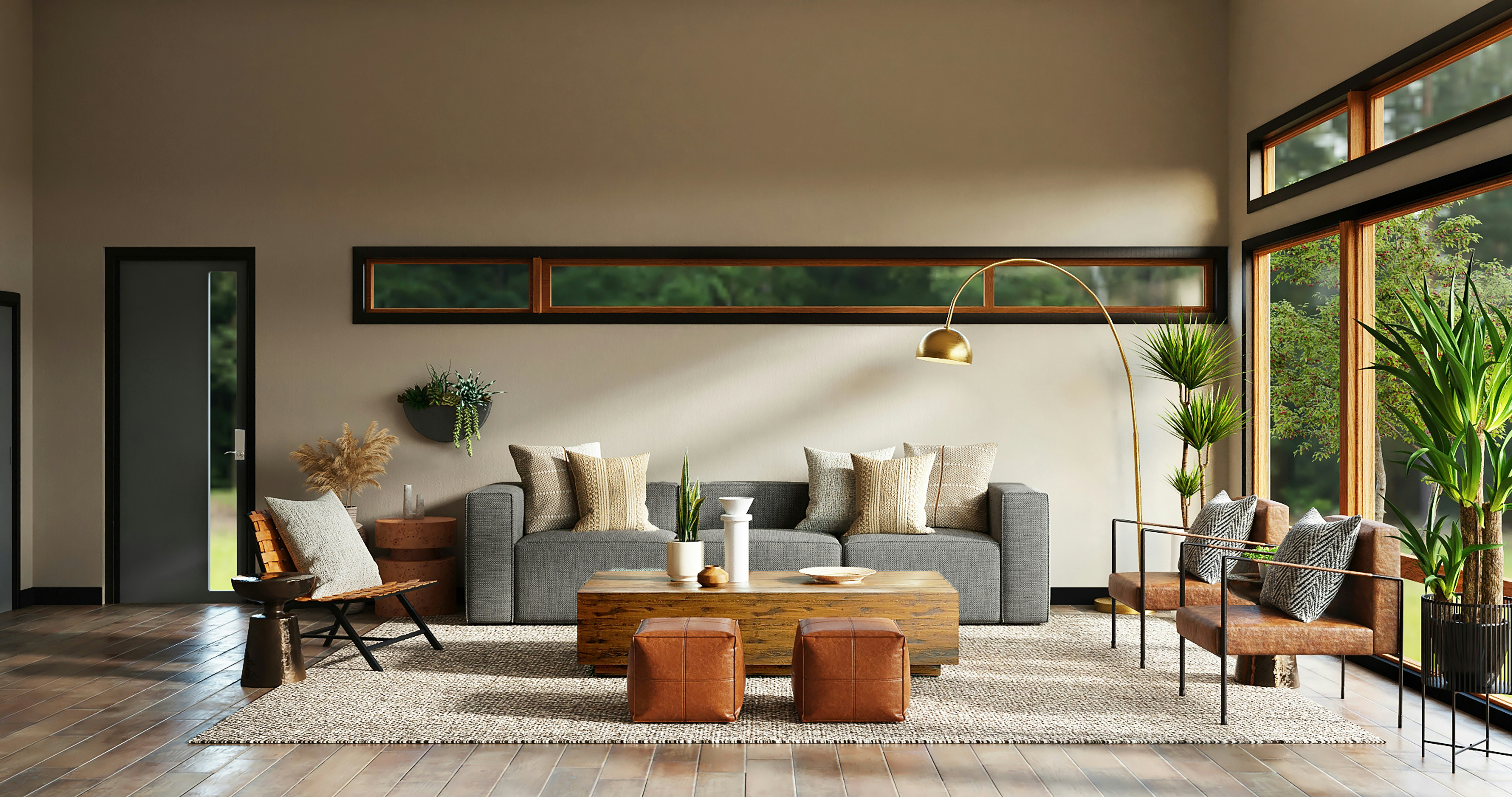
The foundation of 2026 is the warm neutral. Soft, warm whites — like Pantone's Cloud Dancer — are replacing cool, sterile whites, offering a calm, luminous backdrop that still feels welcoming. Alongside them, moody beiges, taupes, and warm greiges are having a major moment, bringing depth and sophistication that flat gray never could.
For a luxury home, this is the smart place to anchor a palette. These tones flatter natural materials, shift beautifully with South Florida's abundant light, and create the serene, quietly upscale feeling that defines the year's mood. They're also timeless, which matters when you're investing in a finish you want to love for years.
Earthy greens
Green is one of the strongest directions in design right now, chosen as a 2026 Color of the Year by multiple brands. The specific shades are muted and grounding — smoky jade, sage, and soft botanical greens with blue undertones, like Behr's Hidden Gem. They read as both soothing and sophisticated, and they connect a home to the lush landscape just outside, which makes them a natural fit for South Florida.
Earthy greens shine in bedrooms, studies, and offices, where they create depth and calm, and they pair beautifully with white trim, natural wood, and warm metal accents.
Rich, warm reds and browns
Perhaps the boldest shift for 2026 is the return of warm, grounded reds and browns. Rich mahogany — PPG's Color of the Year, Warm Mahogany — along with terracotta, clay, oxblood, and cocoa tones, brings a cozy, enveloping warmth that feels luxurious and timeless. These are not loud colors; they're deep and sophisticated, drawing on natural, mineral, and historic pigments.
Used on a dining room, a study, or as a saturated accent, these warm, earthy tones create rooms that feel intimate and considered — a hallmark of high-end interiors this year.
Moody jewel tones for accent moments
For drama in the right place, 2026 embraces deep, atmospheric jewel tones — plum and damson purples like Graham & Brown's Divine Damson, deep teals, and rich blues. These are perfect for the small, high-impact spaces where you can be bold: a powder room, a dining room lit by candlelight, a wine room, or a moody den. Concentrated in a compact space, a dramatic color becomes a memorable moment rather than an overwhelming one.
The application trends: drenching and depth
Just as important as the colors themselves is how they're being used.
Color drenching is the defining application trend — painting the walls, trim, and millwork all in a single hue for an immersive, cocoon-like effect. Done in a warm neutral or a deep, grounded tone, it wraps a room in color and feels rich, enveloping, and thoroughly high-end. It's one of the most striking ways to use this year's palette.
Tonal layering is the subtler cousin — keeping walls, millwork, and furnishings within the same color family to build depth and calm without high contrast. It's understated luxury at its best.
Matte and lime finishes
One of the most telling trends of 2026 is a move toward texture and matte, tactile surfaces. Designers report growing demand for rich neutrals in lime and plaster finishes, not just standard paint. This is where color and craftsmanship meet: a warm neutral or earthy tone rendered in Venetian plaster, lime wash, or Roman clay has a depth and quiet luxury that flat paint simply can't achieve. If you love this year's grounded palette, a specialty finish is the most sophisticated way to wear it.
How to use trends in a luxury home
Trends are a guide, not a rulebook — and in a high-end home, the goal is timeless, not trendy. The most elegant approach is to anchor your home in warm, enduring neutrals and use of-the-moment colors where they're easy to love and easy to evolve: an accent wall, a powder room, a single drenched room. Always consider how a color reads in your home's specific light, and test it in place before committing. That balance of on-trend and timeless is exactly what we help our clients strike.
Request a free estimate — or explore our residential painting and specialty finishes.
Frequently asked questions
What are the interior paint color trends for 2026?
2026 favors warm, grounded tones: soft warm whites, moody beiges and taupes, earthy greens, and rich browns and reds like mahogany and terracotta, plus deep jewel tones for accents. The overall mood is warm, layered, and quietly luxurious, moving away from cool grays.
What is color drenching?
Color drenching means painting a room's walls, trim, and millwork all in the same color for an immersive, enveloping effect. It's one of the biggest application trends for 2026 and works especially well in warm neutrals or deep, grounded tones.
Are gray interiors out of style in 2026?
Cool, sterile grays are fading in favor of warmer neutrals — warm whites, greiges, taupes, and earthy tones. Gray hasn't disappeared, but the preference has clearly shifted toward warmth and depth.
How do I use trendy colors without my home looking dated later?
Anchor your home in timeless warm neutrals and use trend-forward colors in spots that are easy to update — an accent wall, a powder room, or a single room. This gives you a current look while keeping the overall palette enduring.
FirstChoice Professional Painting helps South Florida's finest homes bring color to life, from timeless neutrals to rich specialty finishes, across Palm Beach, Broward, and Miami-Dade. Request your free estimate today.